
Health tracking
app for families

Project details
We had three days to interview the user, come up with ideas and get feedback, then move forward with research, sketching, user flows and to make a clickable paper prototype in the POP app.
The original idea included three-way communication with the Doctor, but more research is needed on HIPPA laws so that feature was removed to be able to reach this initial deadline.


Research
Conducted research to see what kinds of tools were already available to meet the user’s needs in an app format. I found multiple apps that are used to track one particular health issue such as blood pressure or glucose levels, but very little for daily tracking of multiple tests, and none with communication tools for caregivers. Apps for tracking babies’ daily health are popular.
There are websites that track family health overall but these are more complicated, not easy to use, and do not have apps available for easy access in your day to day routine.


CONTENT MAPPING
Content mapping was important for this project to plan for the various ways that it would need to be used. After the first interview, I took all the ideas and wrote them down on squares that I could move around and categorize to try to find some common themes. After consulting with the user about category options and narrowing down the scope, we reduced my initial categories suggestions down to three for the app.

personas
Personas are based on real people for this very specific need, but can be easily translated to other families. I interviewed friends, family members and other students for additional feedback on usefulness of features and level of comfort with the app.
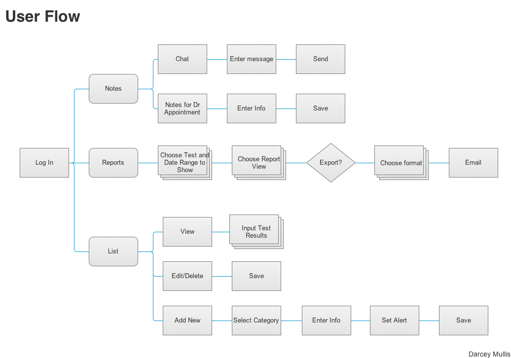
user flows
The original project only included a user flow for the caregiver. When testing the POP app, I realized that the reports were difficult to read and decided to update to add the export feature which is shown here.


sketching
My first sketches incorporated the basic needs for the app, but did not take advantage of easy ways to use movement for edits. The user testing gave better ideas for how to move through the app more efficiently.
Paper sketches were modular to be created quickly, and added into POP for testing. Reports are hard to read on the phone and this led to the addition of an export feature.

wireframes & Development
High fidelity wireframes were done in Sketch, and the prototype in InVision. A link to the clickable prototype is available at the bottom of this image. User testing on the prototype led to adjustments in some wording and types of input options were added for the daily tests (i.e. sliders, text, range.)
Prototype
A video of the prototype is available to the left, and the link is below.
http://invis.io/F73MCPXCY
Tools Used
Axure, InVision,
Omnigraffle, POP, Sketch, QuickTime Player